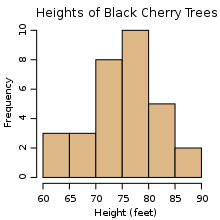
A
histogram is a graphical representation of the distribution of numerical data. It is an estimate of the probability distribution of a continuous variable (quantitative variable) and was first introduced by Karl Pearson To construct a histogram, the first step is to "bin"
the range of values—that is, divide the entire range of values into a
series of intervals—and then count how many values fall into each
interval. The bins are usually specified as consecutive, non-overlapping
intervals of a variable. The bins (intervals) must be adjacent, and are usually equal size.
How Histogram Make??
- Enter the data.
- Determine the class width and the lower class boundary (not limit) of the
first class using the techniques for creating grouped
frequency distributions.
- Turn off any regular plots: Hit Y= and position the cursor over any equal
sign which is in inversed video (white on black) by arrowing left and then
down if necessary. Hit enter while the cursor is on the equal sign to toggle
between displaying the function (equal sign highlighted) and not displaying
the function (equal sign not highlighted).
- Press the STATPLOT key (2nd Y=)
- Select a plot (usually plot 1) and hit enter
- Turn the plot on by highlighting the ON and pressing enter.
- Set the TYPE to histograph (last type)
- Set the XLIST to the list you put the data into
- Set the FREQ to 1.
- Select WINDOW
- Put the lower class boundary for the first class in XMIN
- The XMAX value should be the lower class boundary for the first class plus
the number of classes times the class width.
- The Class Width should be stored in XSCL
- YMIN should be set to 0
- YMAX should be at least the largest frequency in any class. This is difficult
to know if you're generating the histogram without first writing the table
by hand. If the histogram displayed doesn't fit on the screen, go back and
change this number. A good initial guess might be the sample size divided
by the number or classes. You might round up it to a nice number (multiple
of 5) or add one or two so that graph is completely shown on the screen.
- YSCL should be set based on the YMAX value. A factor of YMAX would be a
good choice (so if YMAX is 30, let YSCL be 5). If your YMAX is small (say
under 10), you might want to set it to 1. This will determine how many marks
are placed along the vertical axis.
- Hit the GRAPH key.


0 Comments:
Post a Comment